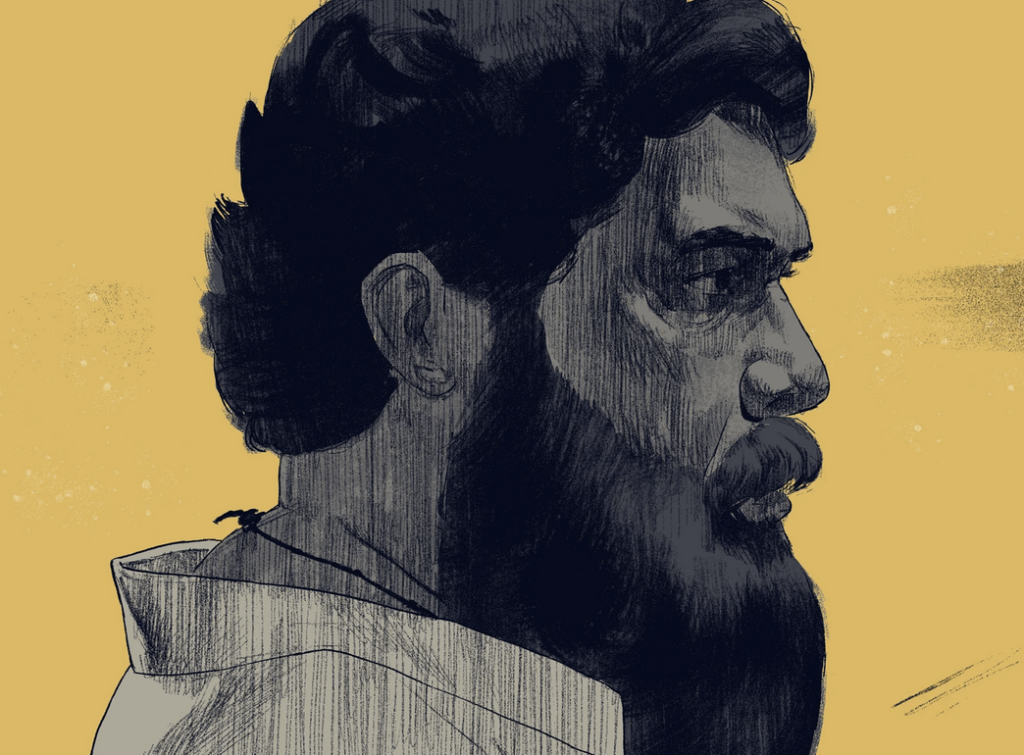
This is the first of a series of interviews with artists, illustrators and creatives. Mohith Mohano is an illustrator and designer based in Kochi. He’s had a fantastic year designing illustrations for movies and TV shows like Rocket Boys, Thallumala, Ankahi Kahaniya and Thurakmukham . In another life he was an architect who then quit to follow his passion for art and storytelling. The following is the transcript of a phone conversation. Edited for clarity
Background
How did you become an illustrator?
I always wanted a Bachelor’s in Fine Arts but my parents told me I wouldn’t get a job if I did a BFA. So I did the next best thing. I didn’t want to to go to Engineering college so I did architecture instead. I still liked architecture when I was learning it. Then I practiced it for 2 years and completely hated it by the end [laughs]
I went to College of Engineering in Trivandrum. I used to go the fine arts college in Trivandrum with my friend Akhil VK (who’s a full on watercolor artist now) and check out the degree shows and hang around there. I practiced for 1 year in Calicut, Kerala and another year in Ahmedabad, Gujarat. The one in Calicut was an MNC. The one in Ahmedabad was a small firm and it was more fun. I was doing larger projects like schools and colleges. I still wasn’t into architecture. I thought I’ll take a break and do something I love. I was always drawing even when I was an architect. Had a sketchbook that I drew in when I had tea breaks and was always on Pinterest searching for illustrations
I had a teacher in CET who used to teach at NID in the film division. I used to chill with him. He pushed me to do the Master’s in Design. I applied to IDC. At the time, the entrance fee was ₹1500 for IDC and ₹2000 for NID. And I had only ₹1500 in my account and didn’t tell my parents about it. So I ended up at IDC because of that. They also had typography, graphic design, and cinematography, and I wanted to learn all the things I missed in architecture school. I wrote the entrance exam, got a decent rank – 9th in all of India. Then I told my parents, and they were happy, now you can go do whatever you want [laughs]
Okay so you basically did your Architecture program, then worked for 2 years and did a master’s program at IDC.
Yeah, that’s in the Industrial Design Center at IIT Bombay.
So this wasn’t an illustration program?
No it was a Master’s in Communication Design program
How did you end up designing title sequences for movies and book covers
I wanted to do comics. Both my graduation projects were comics. Do you know Orijit Sen, he made the first Indian graphic novel called River of Stories? I was selected with nine other artists across India for the Kochi Biennale. It was a month long workshop they conducted with Orijit Sen. I went there and was working on a comic and met Kokaachi Studios. They saw my work, we connected and started working on a project together.
And you’ve had a pretty long history with them. You’ve worked on at least 10 projects with them
Yeah, more than 10 I’d guess. We got started with an anthology called Ghost Stories with Anurag Kashyap, I did the typography for that. Then there was Paava Kadhaigal and Pitta Kathalu. I did the typography for a few more projects. The first illustration project was Thuramukham.
Let’s talk about that. You’ve had a pretty great year, 4 different projects- Thallumalla, Thuramukham in Malayalam and Ankahi Kahaniya, Rocket Boys and Pippa in Hindi. You must feel pretty good to have a bunch of successful projects under your belt in such a short time
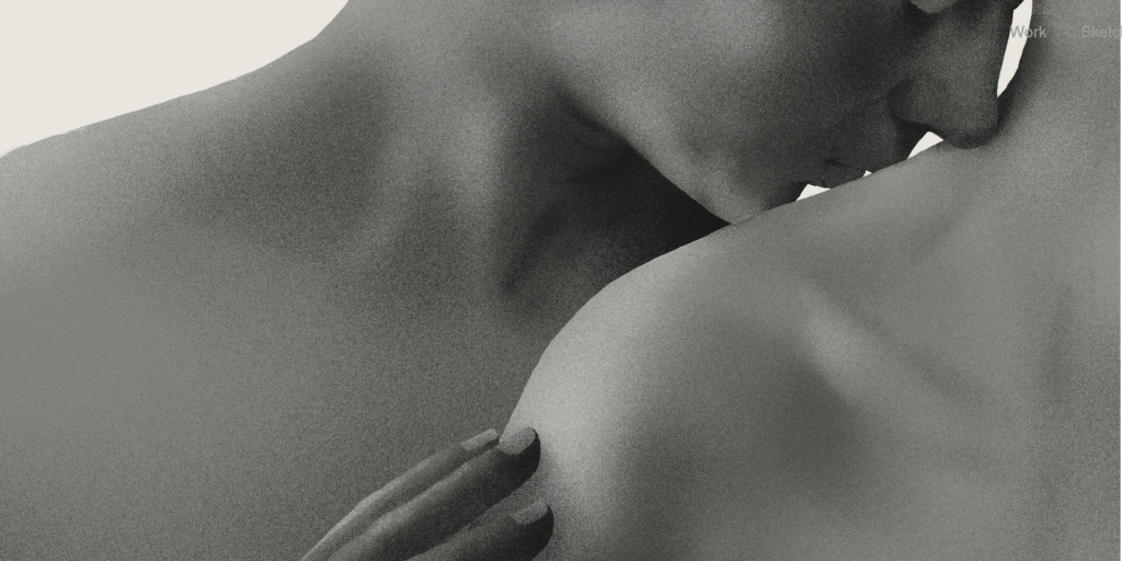
[laughs] Yeah. It’s nice. After a while I got a little burnt out. Because the time you get for projects is pretty short. Usually 5-7 weeks. You know Patrick Clair of Elastic? The guy who did True Detective’s title sequence. He said they usually take 1-3 years. That’s the difference between India and abroad.
Title sequences are usually an afterthought. Some aren’t. Like for Thuramukham, the director had a vision, he wanted to show a story within the title sequence. So he had approached us a long before the movie released. In other projects, there’s too much pressure
Process
What was your process for collaborating on the title sequences?
Usually Pratheek and Tina, the writers at Kokaachi studio come up with the core concept. They write the script. I used to go to their place to brainstorm and come up with visual ideas. That’s the first stage- thumbnails. I’d have to break down visually what they’ve written. We’ll create thumbnails and arrange them in different scenes and make an animatic with the thumbnails. I don’t know how to do that, so someone else does it. In some cases, they may have already given us the music and that’s a better way to do it, to arrange the thumbnails along with the music. And paced in a pleasing way.
After that we send it to the director and get approvals. In that time, we’ll try out some illustration styles. We may take one thumbnail and try it in different styles and get the approval for that as well. After the thumbnails and illustrations, we do a color script. Thumbnail sized color swatches.
These title sequences are illustration heavy but there’s still motion graphics and VFX components. You said that’s not your strong suit so what’s your process for that?
We have some animators on board as well like Alandev. We’d have figured out the animation sequence at the the thumbnailing stage. That this should be a camera pan or the lady needs to move from right to left. We’d write that on the thumbnails so it’s easy to communicate. Some collaborators are really good at coming up with animations and visuals. They may have some suggestions. My panels might be a little stiff since I’m primarily an illustrator. After I’m done thumbnailing, I’d show it to the animator to get feedback from the animator’s perspective
Mohith walks us through his process for a single illustration from Thuramukham’s title sequence- from thumbnail to finished image
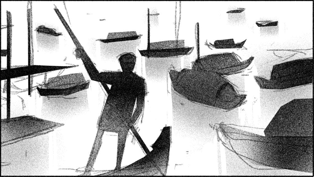
Thumbnail: This was mentioned in the script for this particular frame: “Country boats from Alleppey are lined up at the shore. An old boatman looks at us with weary eyes.”
We opted for a full-shot and graphic approach to contrast it with the majority of other frames that feature close-ups/ Medium close-ups of the actors. The textures, color key, etc for the title sequence were already decided by this point
Pencils:
I began drawing the raw boats on a perspective grid to anchor them down.Otherwise, they might appear as though floating in the air
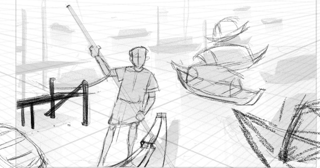
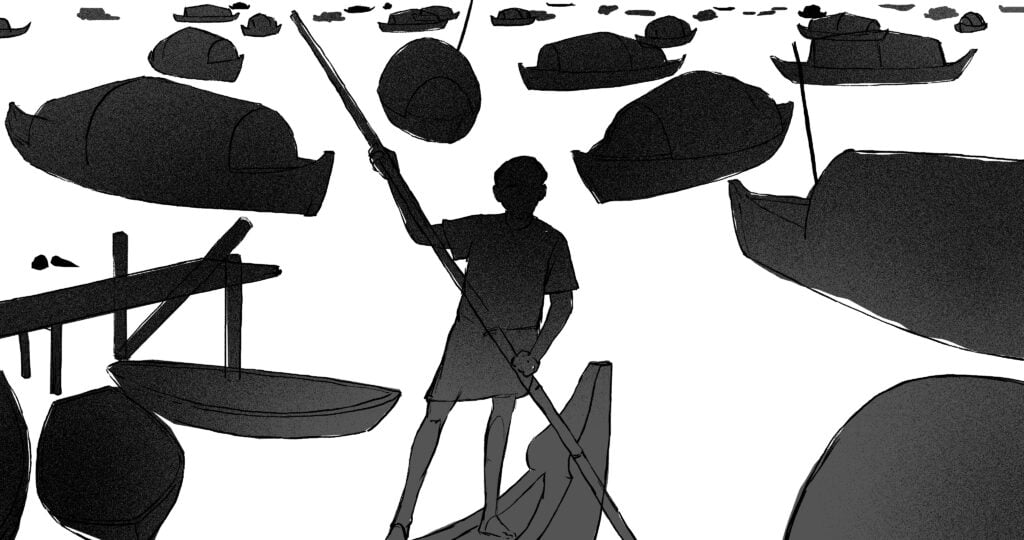
Inking: I filled in the shapes to assess their visual appeal and flow
Final Version: I moved and edited some of the distracting shapes, such as the raw boat at the top left that was drawing too much attention. By cropping it, the focus is redirected back to the main figure. I also added reflections, textures, and other elements
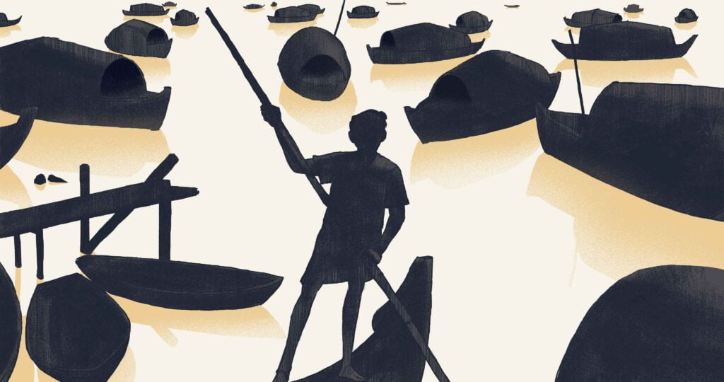
Something I really liked about your recent work, aside from your draftsmanship which is really good, are your compositions. Especially the images within images. They read really well and communicate the idea clearly. The colors look good in the final image, but even without that they have a great value structure. I was wondering how you overlay these different pieces together in a single image.
I try to get the values right in the thumbnail stage. I’m primarily a draftsman and only then a painter, I don’t think in color. With title sequences, you get only one minute to tell a story so the image has to read on the first glance. In the thumbnailing stage, I put down all the values. It can be a two value system as well, you (the viewer) can figure out what goes where.
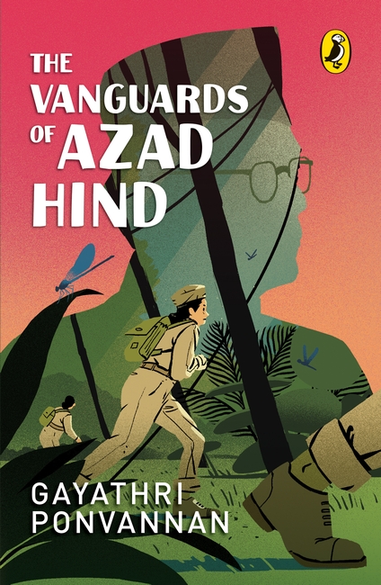
As an example, in the illustration for the book cover of The Vanguards of the Azad Hind. I really like that sort of image, partly because it’s something I would find hard to come up with. Is this just how your brain works or does it take some amount of iteration to come with a design like that?
I take a lot of time! I like graphic design and I like playing with negative space. I get really excited when I see these kinds of illustrations so I try to replicate that excitement. I don’t come up with it very easily, it does take a lot of time. When you see it on your Instagram feed, people think it’s very easy, right?
Freelance life
On the subject of work, let’s talk about the freelance life. You’ve been wearing the freelance illustrator hat for how long?
4 years now
What does your day look like?
I start my day at 10 o’clock, I wake up and sleep late. I try to practice drawing for a maybe 30 minutes or an hour if I’m really into it. After that I get into work, whatever I have on my plate. And I work until maybe 8.30-11pm.
Work life balance is a bit of a mess right now. I worked on a project called Pippa and it was really hectic and thought I’d take a break. I’m trying to take on fewer projects and stop my work at 7pm . I’m learning to do that.
What’s something you didn’t expect being a freelancer or artist?
The gaps between projects. I always thought once you’ve established yourself, and I’m not saying I am [laughs]. I’ve been doing this for 4 years. I always thought once you’ve done enough projects, they’ll start to snowball. That’s not the case. It’s never the case. There’ll always be gaps between projects and you have to deal with it. You have to have some financial backup. That blew my mind. I had worked for a company before and was used to getting a paycheck every month.
Pratheek and Tina helped a lot. I didn’t have to find a lot of projects myself, and took a lot of projects through Kokaachi. You have to self promote and I suck at it. I’m learning to do that.
Influences, Tools
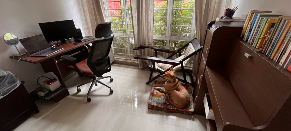
On the right, I have a small library of Malayalam and English books that I read while sitting on my armchair (it’s super comfy). Disco, my dog, thinks he owns the place.”
Let’s talk a little bit about your influences. Are you consuming any art or art education at the moment? Books, podcasts, music, blogs?
Podcasts, I listen to 3 point perspective, Draftsmen with Proko, Art Chats by Ayan De Choudhury.
Books- I’m always reading something. Currently I’m very influenced by Alex Toth, his comic work, his very old inking work and stuff. Apart from that, I’ve been reading Framed Ink by Marcos Mateu-Mestre. It’s really good! It’s like the bible for composition. I like Art of the Title as well. And Line of Action for poses and reference.
Digital or analog?
I like the way analog feels and that there’s no undo button. And there’s the feedback. Touching a brush on sketchbook, there’s no way you can get that feedback on an Ipad or Wacom tablet. Different tools feel different on your hand, I like that feeling. That said, digital has it’s purpose. We did Thuramukham’s open title sequence in 5 weeks. You can’t have that kind of flexibility with an analog work setup. When I travel and relax, I draw on my sketchbook. For work I prefer digital.
Let’s talk tools. What are you using at the moment?
I have a very simple Wacom Intuos Pro tablet, their smallest size. I work on Adobe Illustrator and Photoshop. Mostly Photoshop.
I love the Pentel Fude and Pentel Pocket brush pens. And the Sakura water brush pens. You’ve heard of the Koi? Very cheap, they’re water brush pens that I fill up with ink. And I like the way they feel.
I was going to ask, I saw a whole series of grayscale images on your Instagram that looked like they were done that way
Yeah they were done with the Sakura pens
So when you want jet black, you use the Pentels and for grays you use the Sakuras?
Yeah, I’ll have one pen filled with 25% ink and baaki water and another pen with 50% ink and 50% water.
That was a really cool series, the images were super readable and really beautiful. Do you spend a lot of time learning new skills or are you past that point, and you’re using what you already know to work on your assignments
Not at all. I have a huge complex that I didn’t do my bachelor’s in fine arts and I’m still learning the basics of anatomy, color, and other things that newcomers to fine arts programs learn.
What do you want to get better at?
Currently want to get better at color. And if I had more time, I really want to explore 3D sculpting like Zbrush. I’m not at all familiar with that stuff.
What does the future hold for you?
I’m working on a couple of animated shorts. Some small scale publication projects. Right now I’m taking it slow because I want to take a break from the busy-ness. And I’m working on another small Malayalam film project that’s finishing up right now.
Last, how can readers find your art? And how do people reach out to you for commisioned work?
They can find me at mohitho.com and my Instagram. Reach out to me for commissions at mohitho@gmail.com
Shout out to the team behind Thuramukham #creditcreators
- Concept, script and direction: Studio Kokaachi
- Illustrations: Mohith O
- Animation: Arijit Ghosh, Alendev R Vishnu
- Compositing: Arun Ramesan
- Typography: Sujith Navam
- Compositing asst: Mohammad Ijaz
